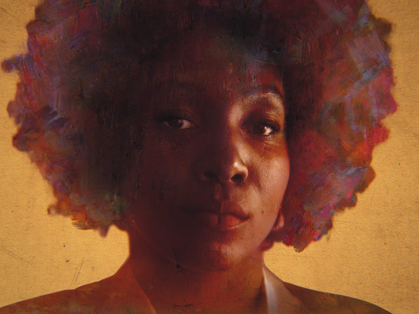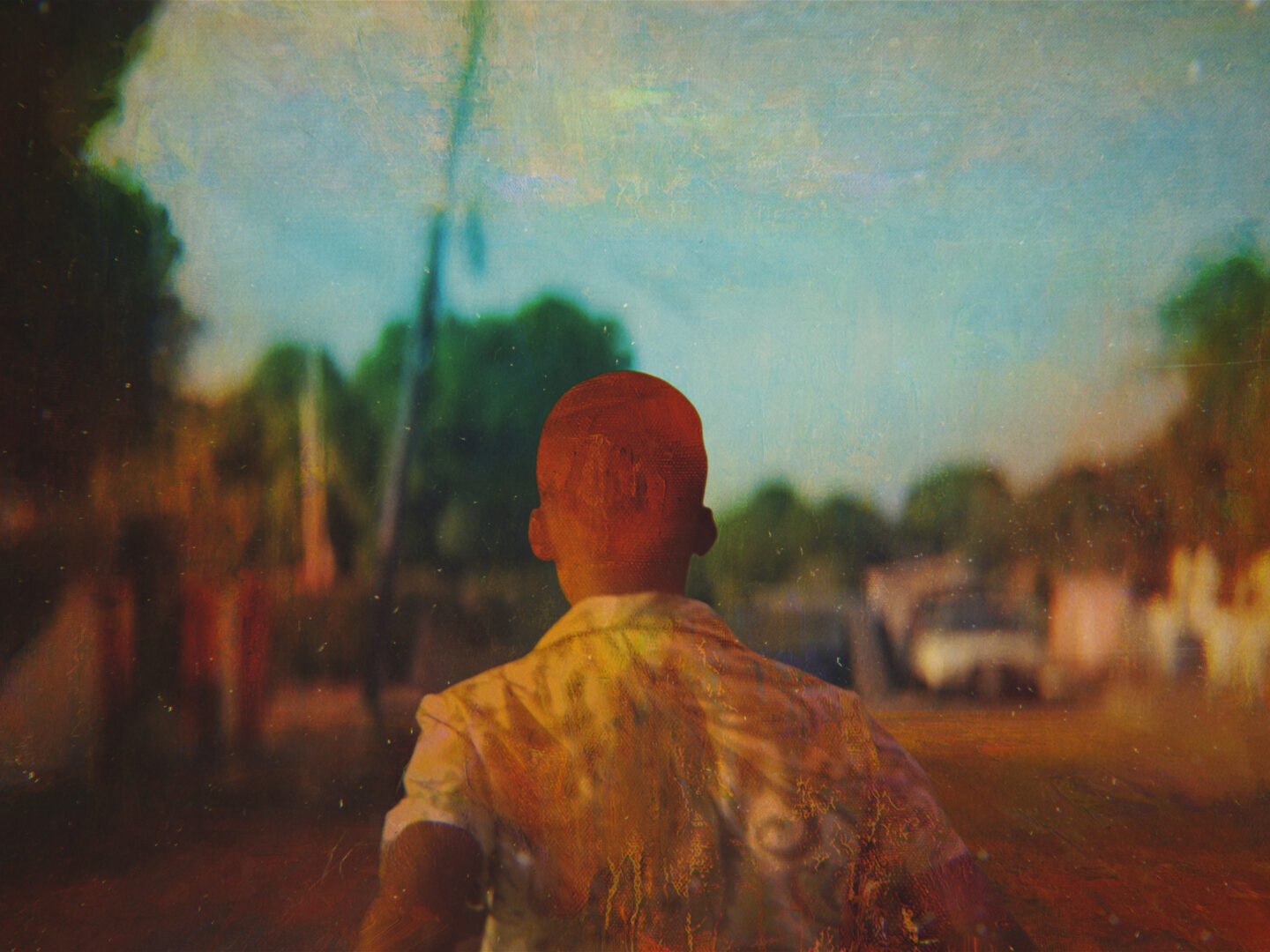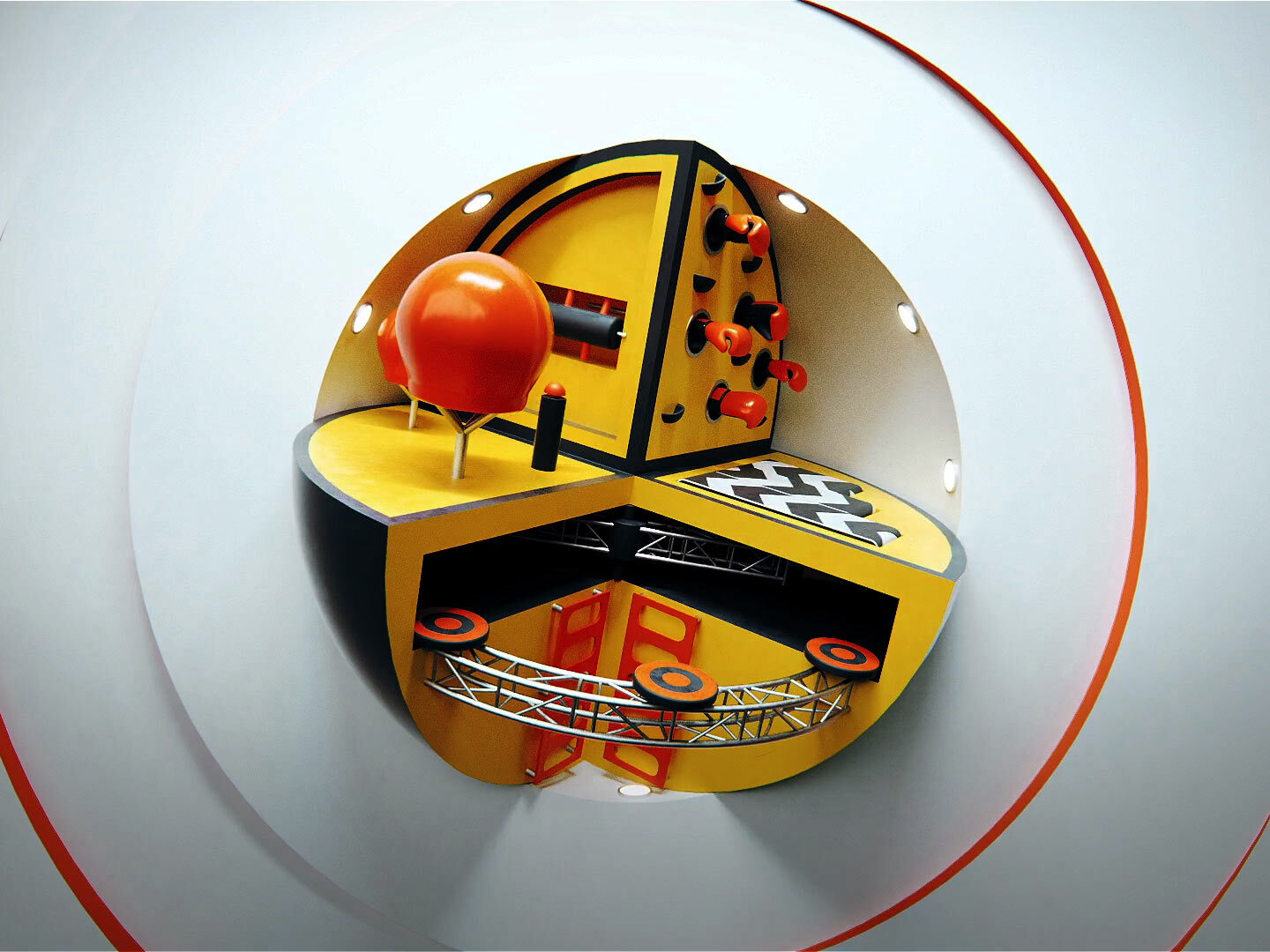
'Challenge Accepted'
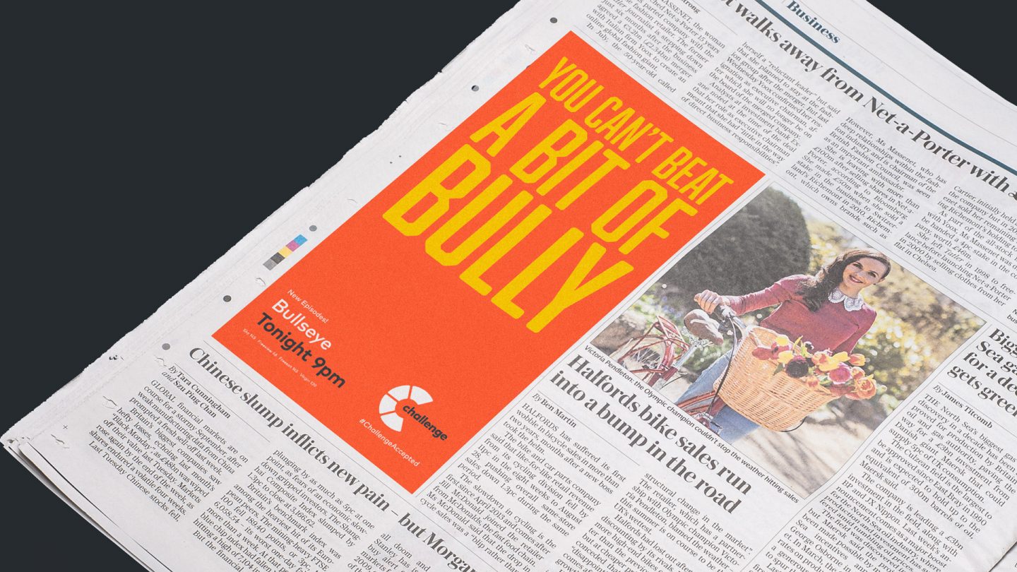
A core brand proposition was required that would cover the channels three core content pillars and expand the reach of the channel and brand beyond the confines of the small screen.
Working closely with the in-house creative team and other key stake holders, we were able to explore what the main elements of the brand were. ‘Challenge Accepted’ was our collective reply – the war cry of the Challenge audience, a positive call to arms bringing the audience into the game.
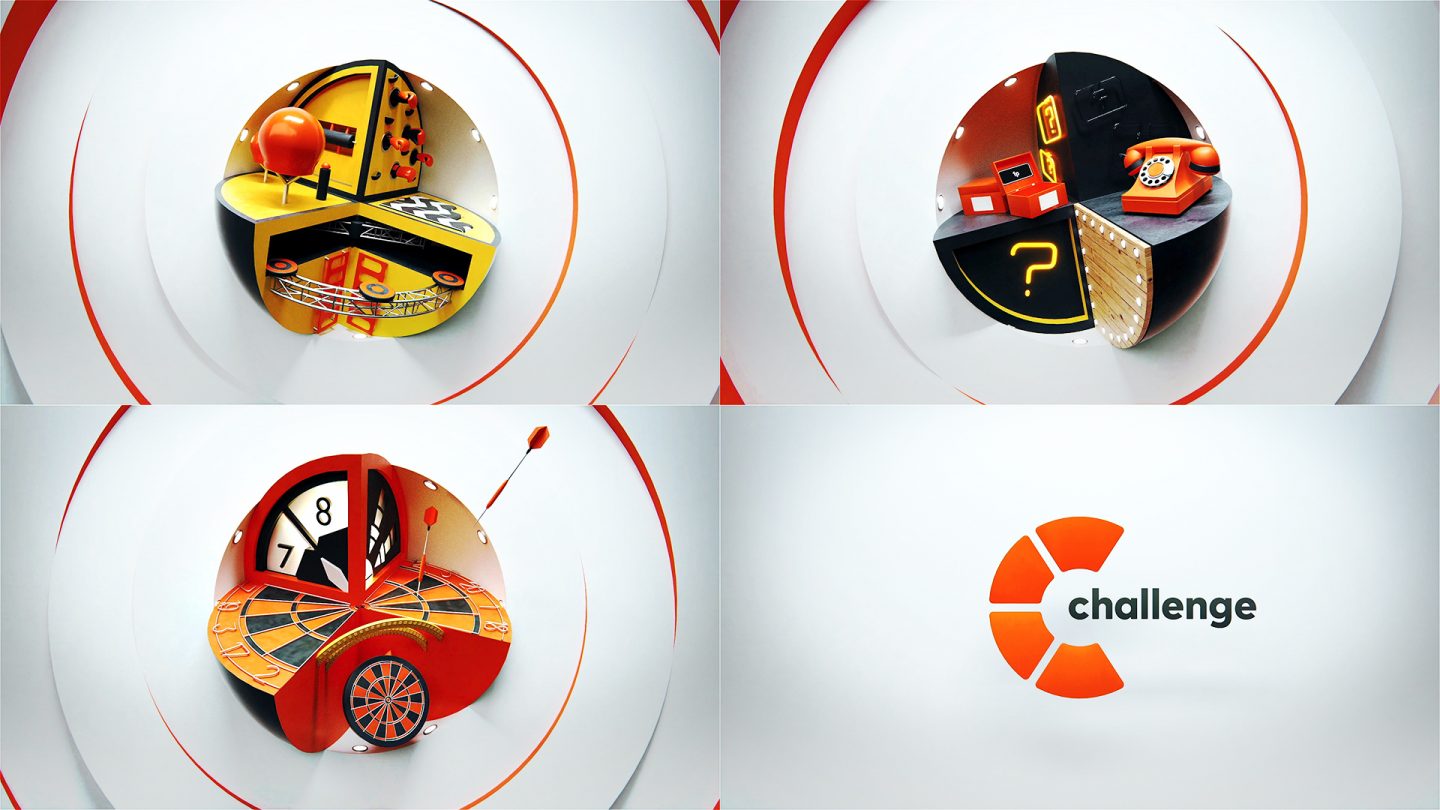
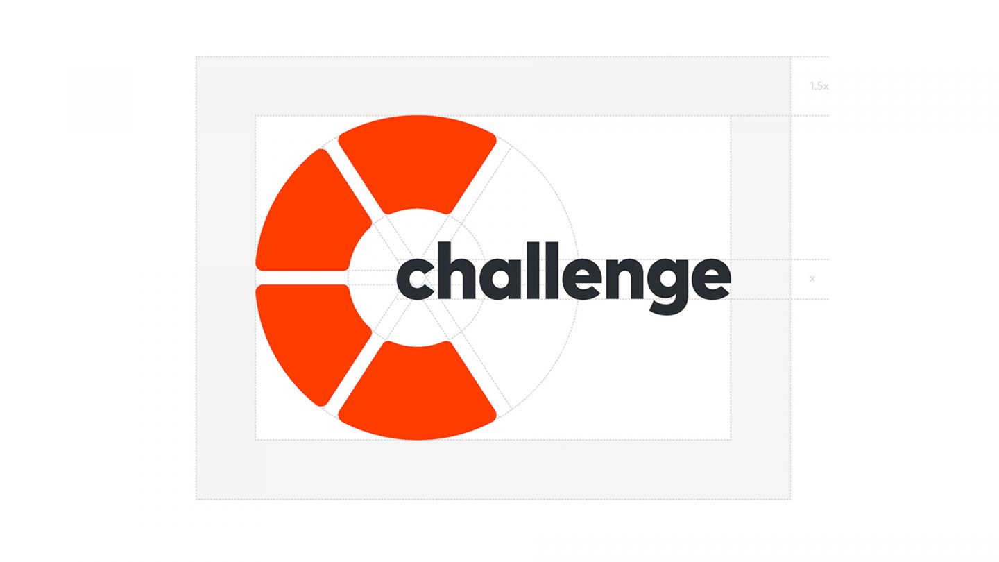
Challenge Logo
Based on a perfectly round buzzer button, the Challenge logo will consist or a logo mark and logotype, which can be used together or individually depending on the placement.
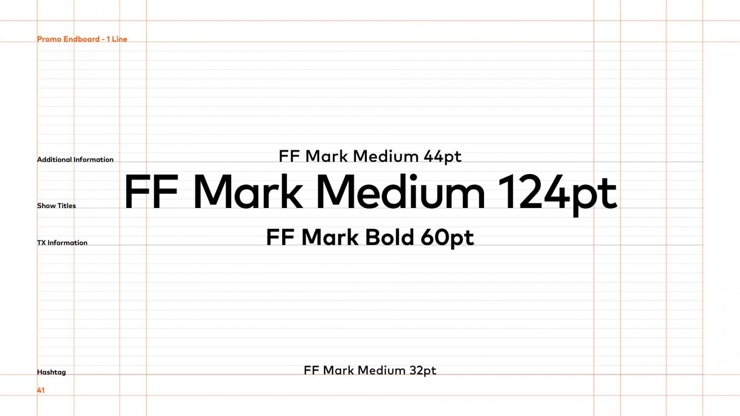
FF Mark Pro
The logotype is based on the typeface FF Mark Pro, a chunky typeface that feels bold and fun, with the geometric 'C' being used as a basis for the logo mark
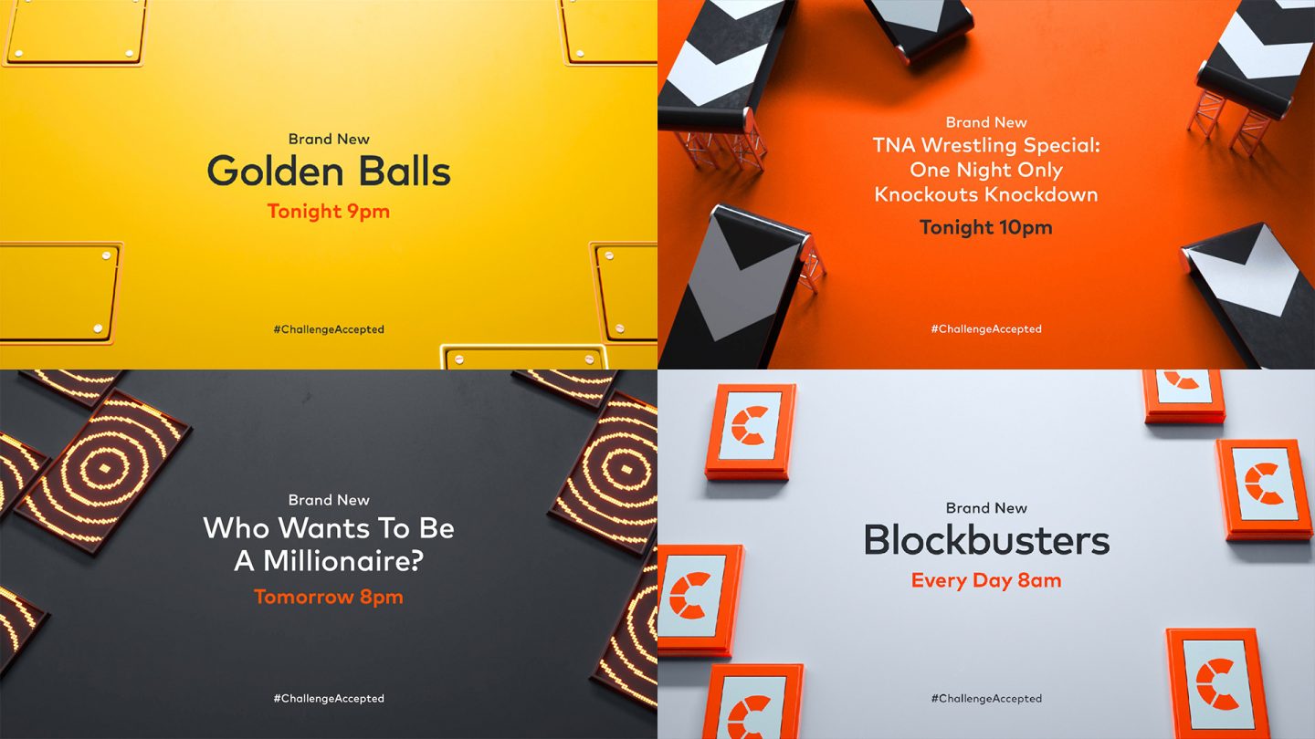
We created break bumpers that posed a question at the start of the break and gave the viewer the answer after, a good solution for holding the viewer over the break as well as sitting nicely with the core concept.
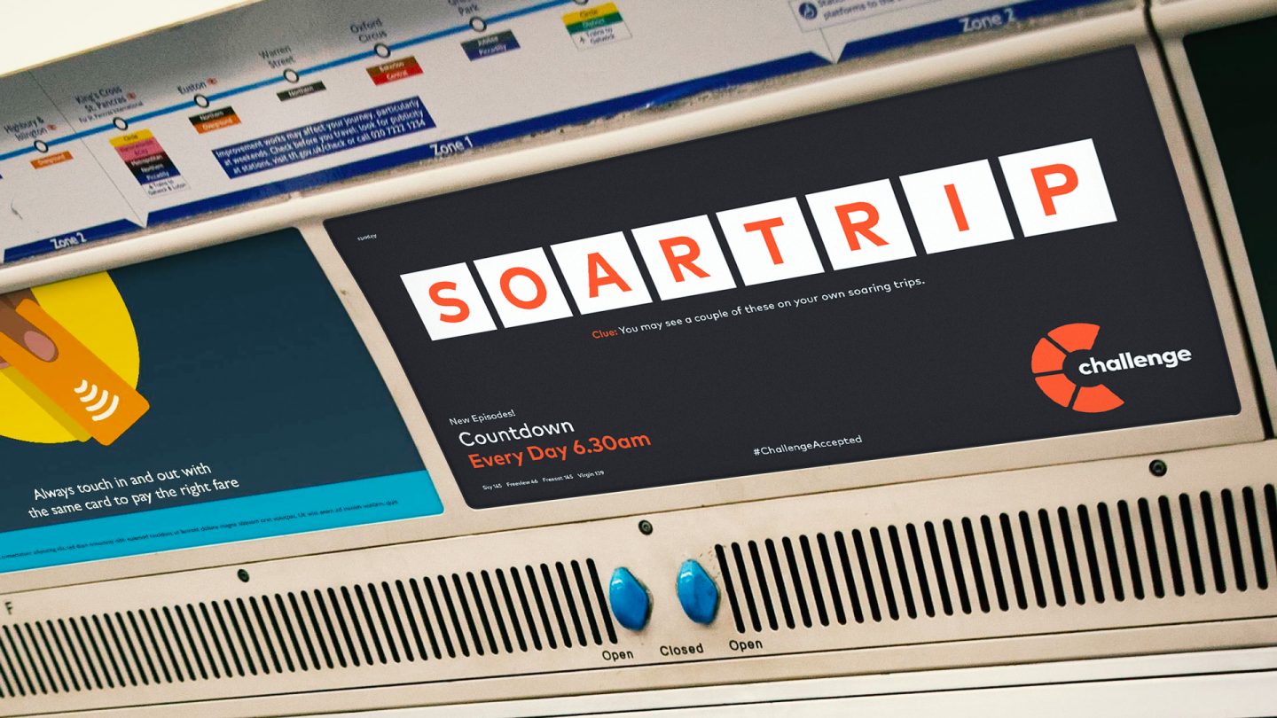
OOH
We wanted to bring in elements of interactivity with the viewer wherever possible and await their reply, 'Challenge Accepted'.
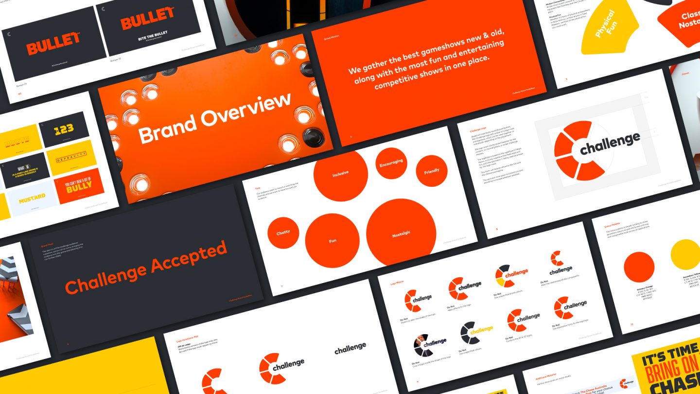
We created a detailed style guide for the Challenge brand detailing both on-air and off-air applications.
