Pick TV Ident

Pick TV

Sky Creative

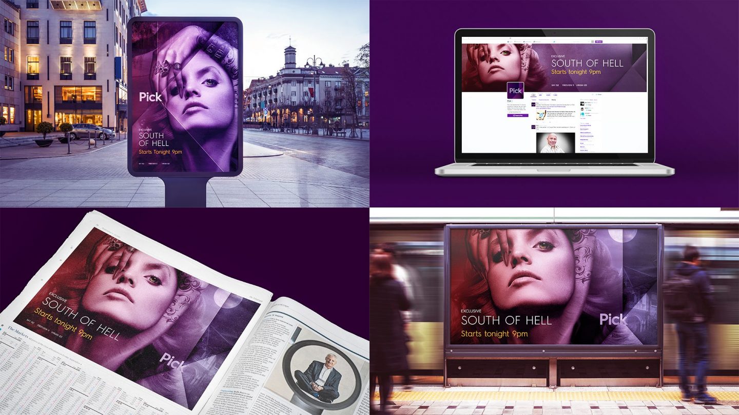
Pick needed a new a fresh look to match it’s edge-of-your-seat content. We worked with the in-house team at Sky Creative to develop a new direction for the brand including OSP, idents and off-air templates.

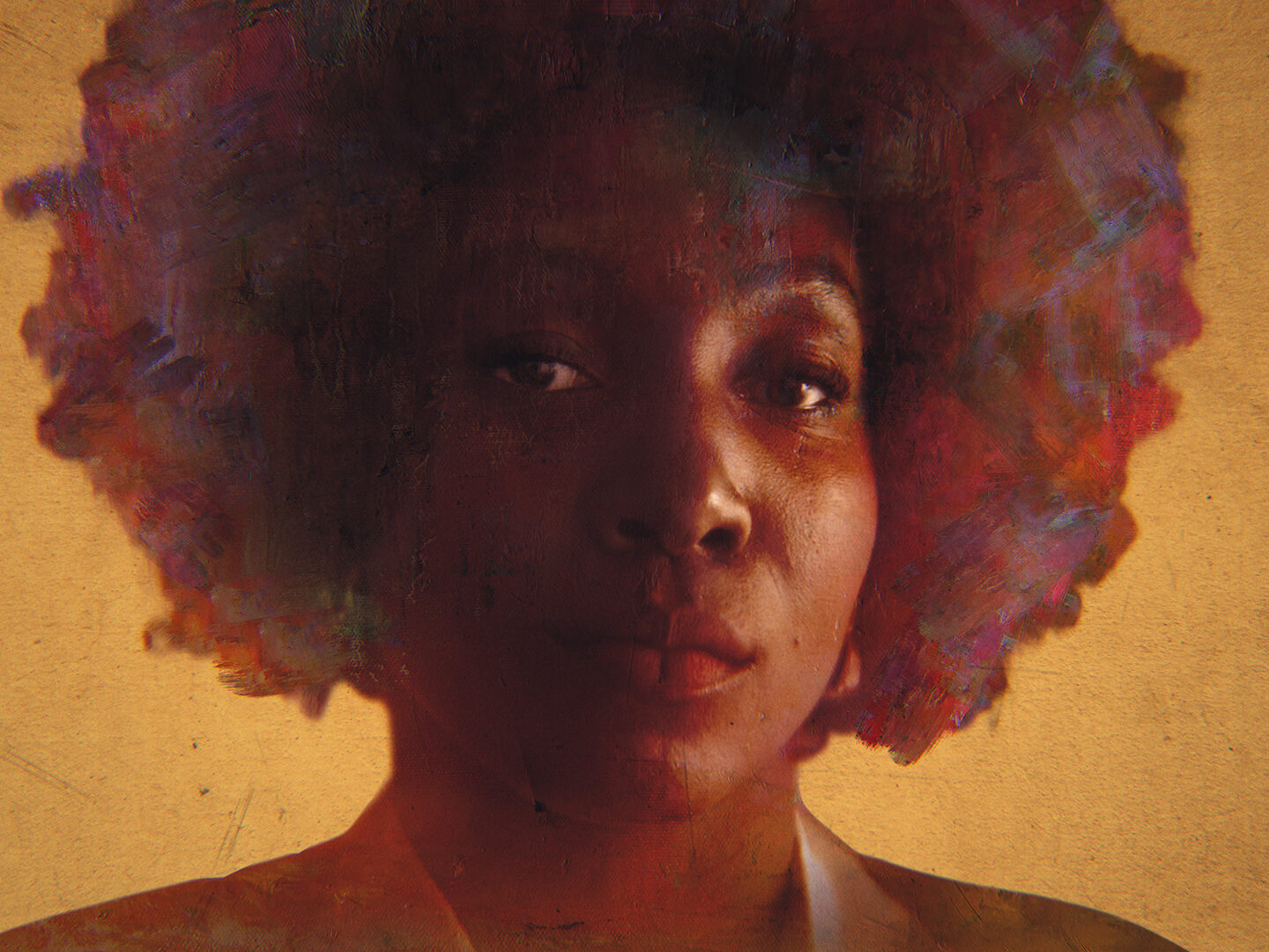
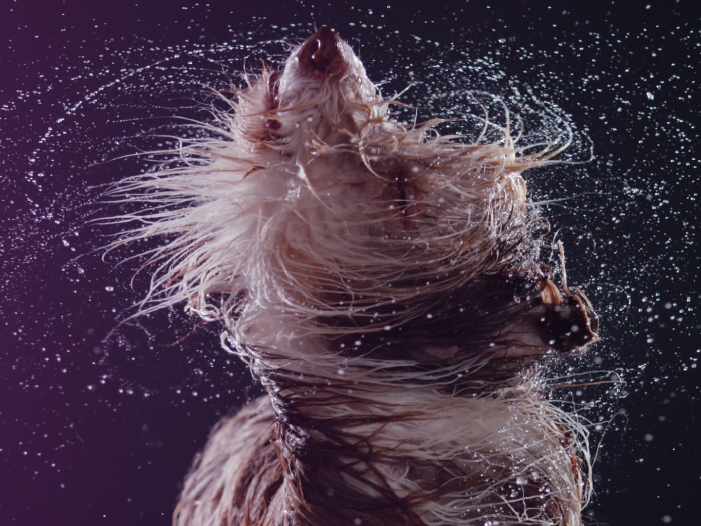
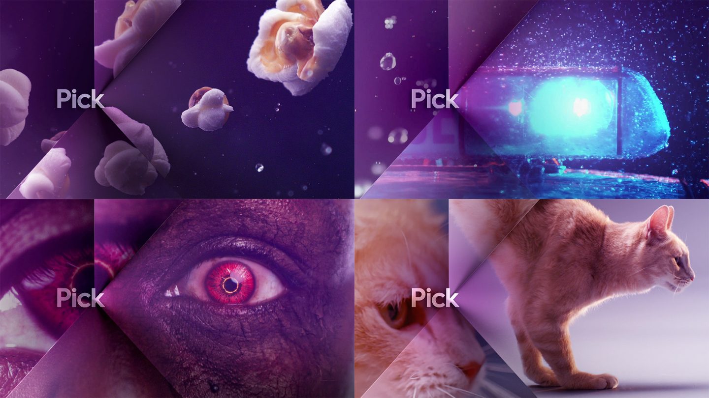
We created a suite of idents that reflected the breadth of the channels content, from the light hearted to the heart pounding, that could be used across the days schedule tying in nicely with the programming. The ID’s focus on the everyday but intensify these scenario’s using super slow-motion making the viewers life more vibrant and interesting reflecting the content on Pick that makes everyday more exciting.

Pick TV Idents
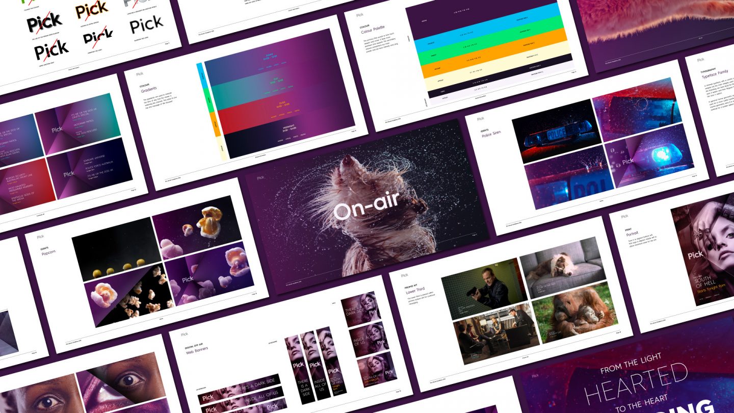
Pick TV Brand Guidelines

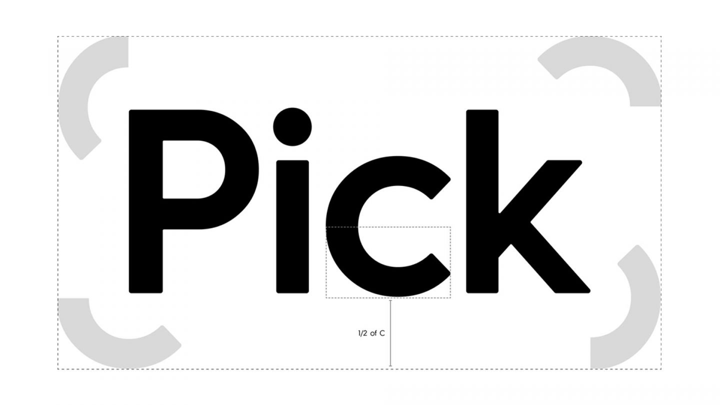
Secretly subtle or strikingly bold but never dull, we chose Hurme Geometric Sans as the channel typeface.
Pick TV Brand Guidelines

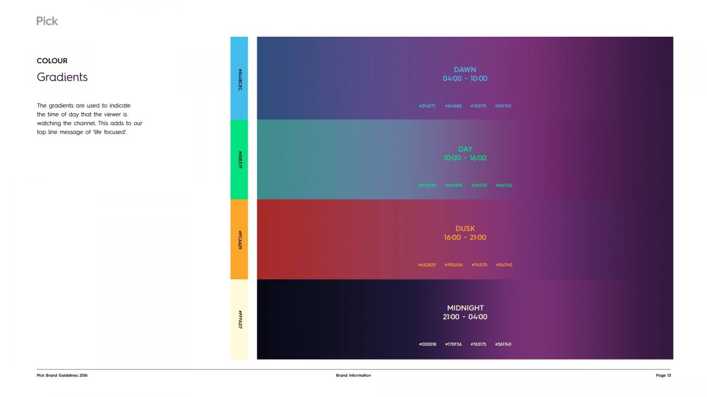
The colour palette is a range of pink to deep purple hues which change to reflect the time of day - from dawn to twilight Pick TV is always a place where you can get your fix of shows like Z Nation, Monkey Life and Police Force.
Pick TV On Screen Packaging

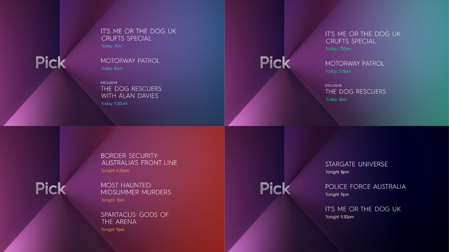
For the on screen packaging, a changing set of colours reflected the different day parts, from the warm glow of the dawn to the deep blue of the night that allows the packaging to reflect the content.
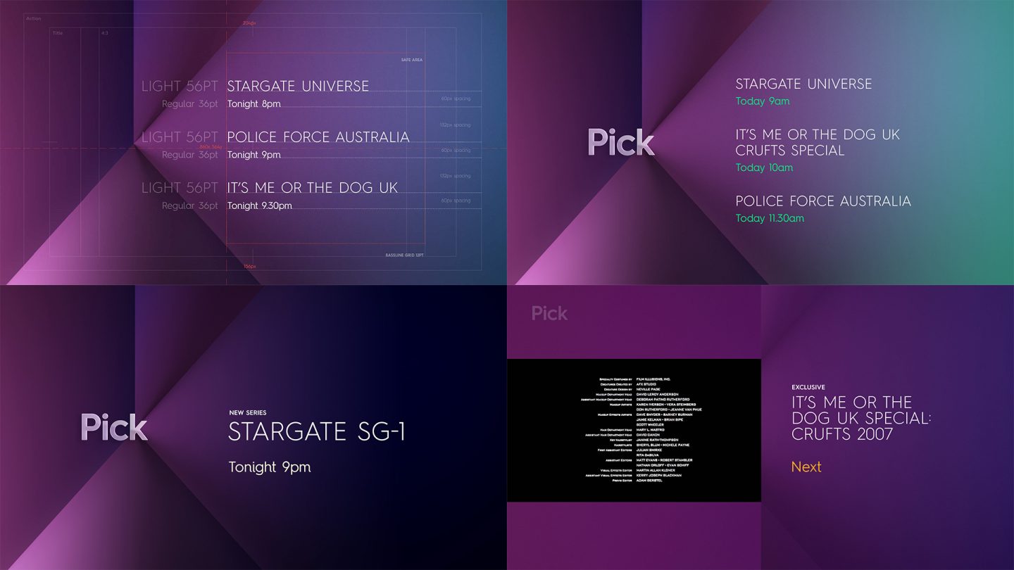
Pick TV On Screen Packaging

Off-air toolkit

We created conclusive toolkits and style guide that covered all areas of the brand and allowed for simple rollout by the internal teams at Sky.

Pick TV OOH
Pick TV Brand Guidelines